Tuesday, 15 March 2016

Kevin Corrado Experiment


My experiment was based on series of images Kevin Corrado has produced where a hand and forearm can be seen with paint covering the hand that matches the colour of the background/landscape. Compared to his images this piece is not entirely accurate and when seeing his images compared to mine you can see some differences within them. Firstly, my horizon line is not in the correct position and is situated too high up the canvas compared to his image and also I was zoomed too close into the landscape and I just focused on one area in the landscape instead of considering the surrounding areas. The colour of the paint isn't as much of a match as I first thought it was when viewing it in the shop and therefore doesn't create the effect that I was aiming for. 


If I was to create this emulation again I would make sure that I look in closer detail at the photographers image so that I can get every detail correct and make the emulation more like Kevin Corrado's piece.


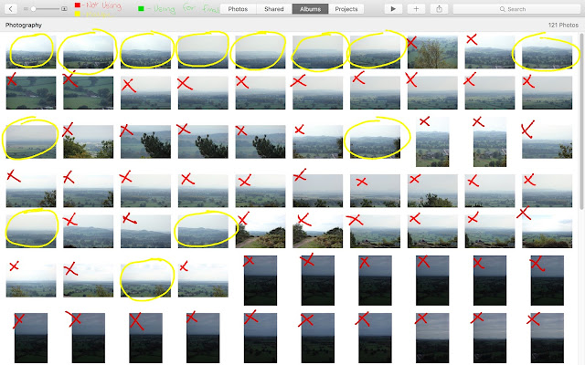
Contact Sheets


Artist Research - Kevin Corrado

Another artist that has interested me and can be related to more towards fantasy and fiction is Kevin Corrado, he is a considerably famous surrealist photographer and his pieces have inspired me the most to pursue surrealism in photography for this unit.


This photograph by Kevin Corrado uses a very limited colour palette as the prominent colours are browns in various shades and some greys out in the distance and this is due to the lack of natural light being included into the photo as there is a dense collection of tree in the background and surrounding the character laying down. However the limited colour palette keeps to the conventions of surrealism and is giving the photo a eery feel to the photograph. Also the fact that there is a body being divided by the photo frame it adds to the surrealism factors of the photo and also make you think twice about what you are actually seeing within the frame.


This photograph again is using a very limited colour palette but this time the prominent colour is greens in different shades and there isn't much variation in other colours. The other colour that stands out to any viewer would be the grey t-shirt and is standing central of the photograph. Kevin Corrado has also included a aperture in this photo to give the character and the clock more importance by blurring and fading the foreground and background. The photo also makes you start to ask questions like, 'Why's he in the middle of the woods? and Why has he got a clock? and questions like this are quite common as surrealism makes you ask question because not everything is apparent to you at first.


This photograph is taken in black and white and is using again a very limited colour palette, black, whites and greys, and is following the conventions of surrealism of photography. Because it is using black and whites it doesn't use any focal colours so you aren't drawn to one certain part that has a different coloured aspect somewhere in the photograph. The focal point is around the person walking down the train tracks but is missing his whole upper body excluding his arms. Where his torso is meant to be you can see down the rest of the track and what you would be seeing if the body was still there. By following the conventions this is a perfect example of surrealism photography as it creates questions and makes you look twice and makes you think about what you're seeing.

Monday, 7 March 2016

Edward Weston Experiments

Pepper 1 - Original Image


Pepper 2 - Original Image


Here are the original images without it being edited in the style of Edward Weston. To create the shadows on this image I used lighting based a fair distance away as if it was too close the shadows would have been smaller than they are and also not as dark as I would have wanted. Also I wanted the lighting to create some different shapes when editing into black and white. Edward Weston's images of the peppers would have been extremely difficult to recreate as the peppers that are sold in supermarkets now are shaped perfectly with little or no imperfection which is completely opposite to the shapes of Weston's.

Pepper 1 - Edited


Pepper 2 - Edited Image


Here are my final images that I created after the editing process, this process I went through to get this final image was extremely simple but effective. The first thing I did was change the image to black and white so it was in the style of Weston and then changed the levels, hue and saturation until I felt happy that the image was starting to create shapes that wouldn't have been there in the first image I took. If I was going to try to replicate Weston's style I would try and use peppers that are a little more deformed and obscure so that I can get different shapes being created with the shadows.


Contact Sheets - Black And White


Contact Sheet - Colour